Whiskley: A Recipe App That Makes Healthy Eating Fun
Whiskley is a gamified recipe app designed for individuals with dietary restrictions or health goals. It provides personalized recipe recommendations, helping users make healthier food choices through fun, engaging features like missions, achievements, and progress tracking, all guided by a playful mascot.
The Problem
For those with dietary restrictions or health goals, finding suitable recipes can be frustrating and time-consuming. Many recipe apps are generic, lack personalization, and don't motivate users to consistently make healthy choices. This makes it harder to form lasting healthy eating habits.
The goal was to create an app that not only simplifies finding suitable recipes but also makes healthy eating an enjoyable, motivating experience. By combining personalized recommendations with gamified elements, Whiskley aims to encourage users to make consistent, healthy choices while having fun.
Research
Data
Paper Prototype Testing
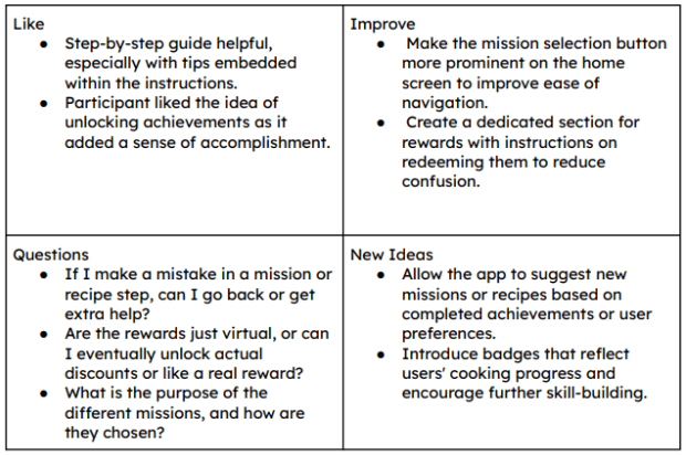
To get early feedback on Whiskley I ran some quick paper prototype tests.
I wanted to see how users interacted with key features like picking missions, completing recipe challenges, and checking their rewards and achievements.
Test Results
Heres what didint work and what i planed to improve in the next iteration
Testers had trouble finding where to start missions
Users wanted more variety and felt the tasks were too narrow
Some steps in the recipe mission weren't clear enough
Users didn't understand how to redeem their points
Add Clear “Select Mission” button/CTA to start a mission
Add more open ended tasks and wider range of options
Add visual cues and rewrite instructions to be more intuitive
Add a dedicated “Rewards” tab with clear list and guide
Wireframing
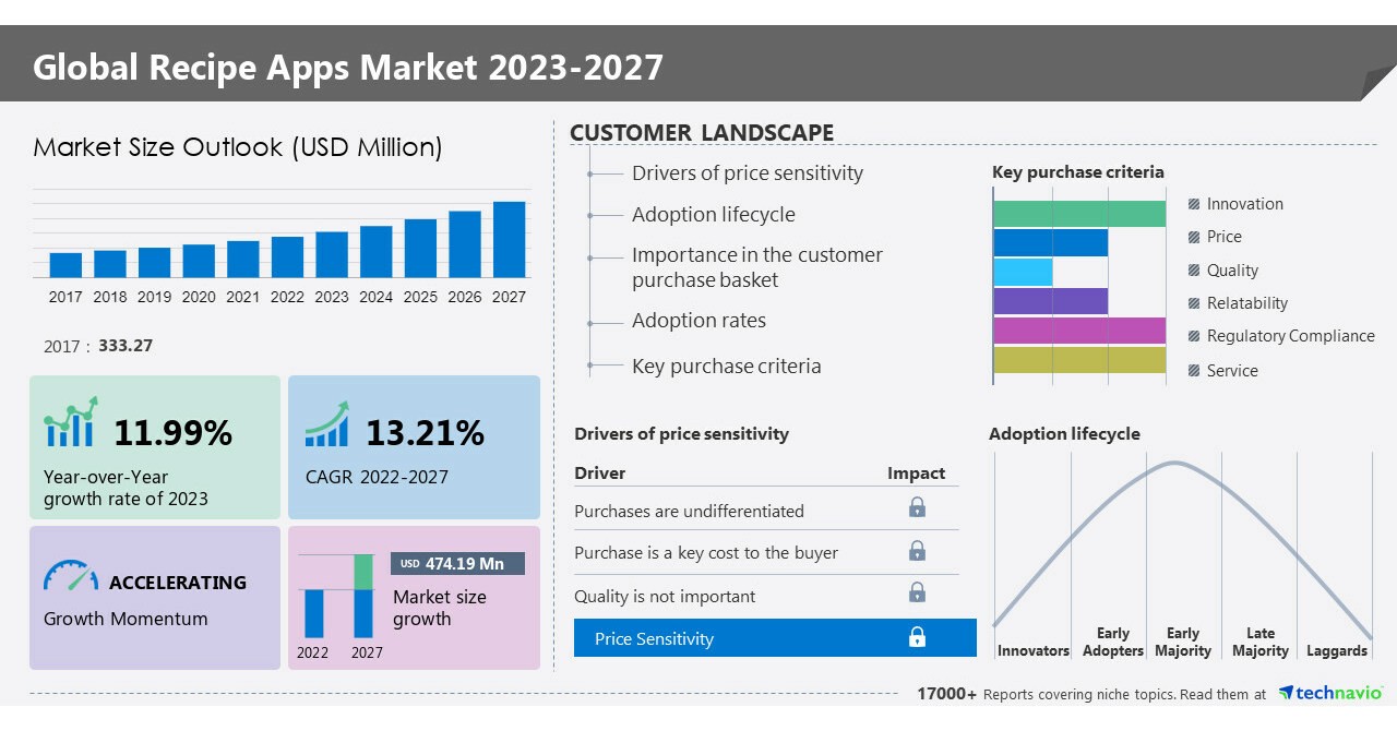
Leading recipe apps like Yummly and Tasty offer personalized recommendations based on dietary needs, while Samsung Food Plus integrates gamification with AI-driven meal plans to boost engagement. Apps like ReciMe and Paprika focus on features like grocery list creation and multi-device synchronization, making meal planning more user-friendly. The recipe app market is growing rapidly, driven by advancements in AI and the increasing popularity of home cooking.
Key Insights
Personalization is Key: Users prefer tailored recipe recommendations based on dietary preferences.
Gamification Enhances Engagement: Features like achievements and progress tracking help keep users motivated.
User-Centric Features Matter: Meal planning tools and grocery list integrations improve the user experience.
Market Growth Offers Opportunities: The expanding recipe app market presents a chance for innovation.
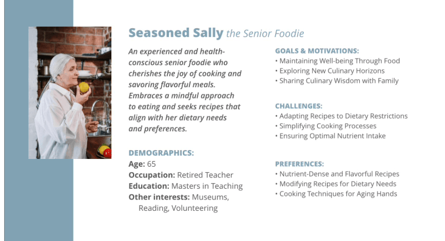
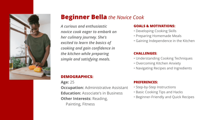
Understanding Our Users
Several personas were provided to help guide our design thinking. From these, I chose to focus on two that represented key ends of the user spectrum—newcomers seeking confidence and experienced users managing health. Designing with both in mind helped ensure Whiskley would be accessible, supportive, and engaging for a wide range of users.
Design Ideation
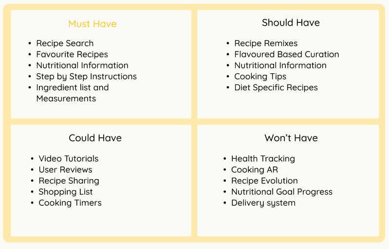
MosCow Analysis
To prioritize features for Whiskley’s MVP, I applied the MoSCoW method to balance user needs with development constraints. This helped identify which features were essential for prototyping and which could be added in future iterations
Exploration Sketches
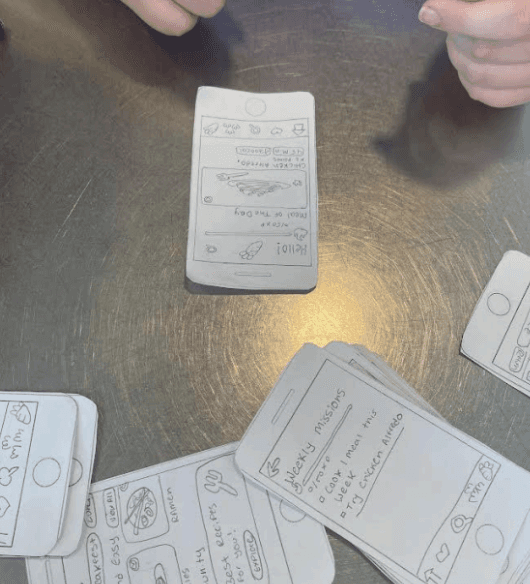
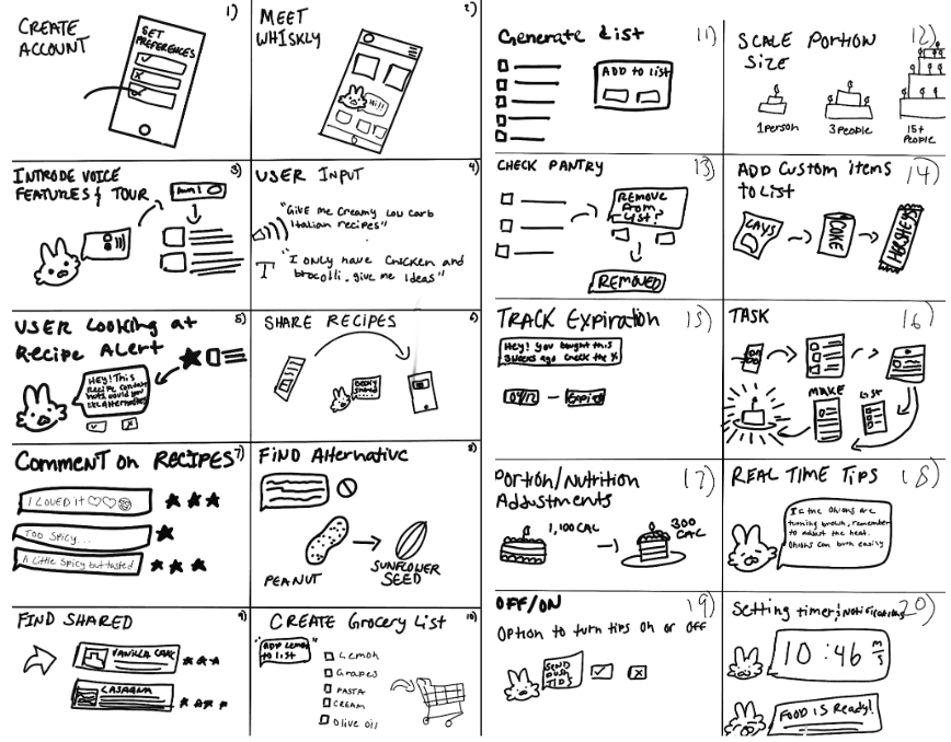
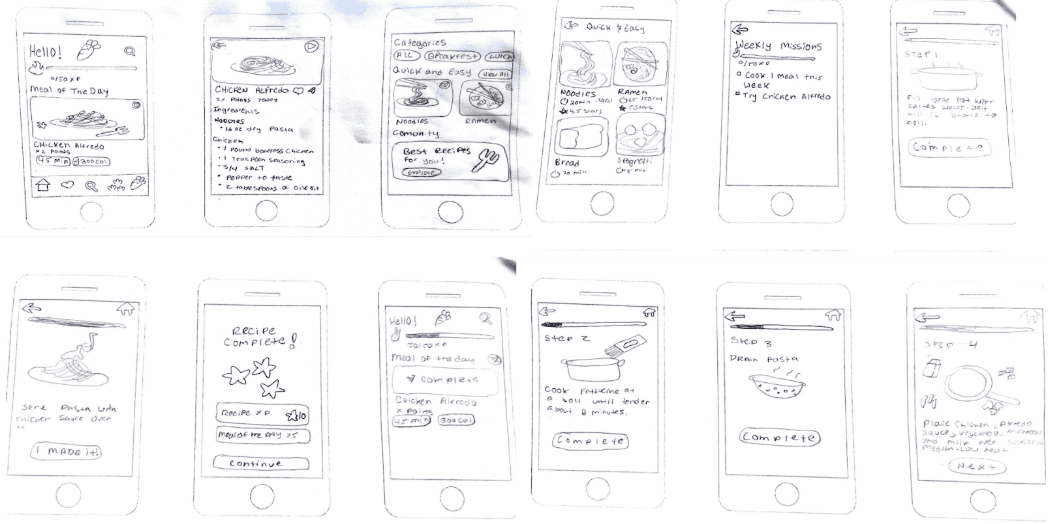
Before jumping into high-fidelity designs, I put together a paper prototype to test out the core ideas with users.
It helped me spot early confusion around navigation and see what parts of the experience felt fun or needed tweaking—especially around finding recipes and understanding missions.
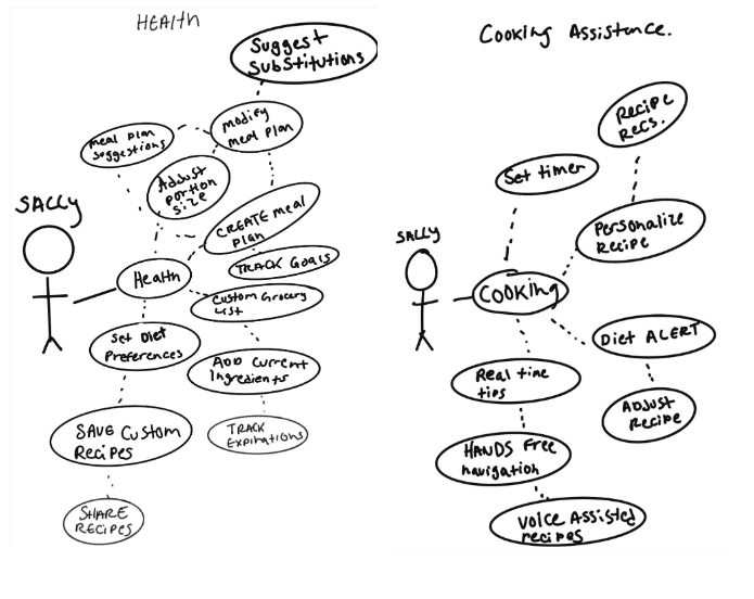
Use Case Diagram
To understand how users would interact with Whiskley, I created a use case diagram focused on health and cooking assistance. It helped map out the key actions—like setting dietary goals and tracking progress—and showed how different features support users in building healthier habits through cooking.
Paper Prototyping
Before jumping into high-fidelity designs, I put together a paper prototype to test out the core ideas with users. It helped me spot early confusion around navigation and see what parts of the experience felt fun or needed tweaking—especially around finding recipes and understanding missions.
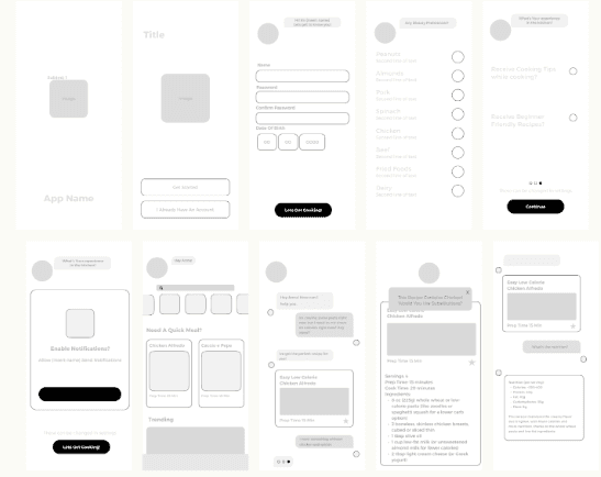
After completing paper prototyping and user testing, I moved into creating higher-fidelity wireframes. Based on user feedback, I focused on making the app feel approachable for users like Beginner Bella, who may feel overwhelmed in the kitchen, while still keeping it efficient and adaptable for more experienced users like Seasoned Sally.
I focused on:
A layout that felt clean and easy to navigate
Step-by-step recipe views with clear instructions
Simple ways to filter by dietary needs
Fun features like missions and achievements to keep things motivating
These early sketches helped me figure out what the app should feel like and how people would move through it before getting into the visuals.
User Surveys
Demographic Surveys
To shape the app around real needs, we ran a survey focused on cooking habits, app usage, and what motivates users—especially beginners.
Most users (73%) were 18–24, primarily students and creatives.
60% cooked 3–5 times a week and mostly used smartphones in the kitchen.
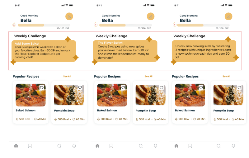
Progress tracking matters: 80% found it helpful or motivating.
Task-based motivation: Users liked aligned task lists and recipe suggestions.
Gamification appeal: Rewards, badges, and encouragement were more engaging than competition.
Key Findings
Takeaways
Show progress visually (streaks, bars).
Personalize tasks and recipe suggestions.
Keep motivation light and supportive, not competitive.
App Feature Surveys
To refine Whiskley’s experience, we tested various features—from message tone to color schemes—to see what resonated with users.
Message Tone
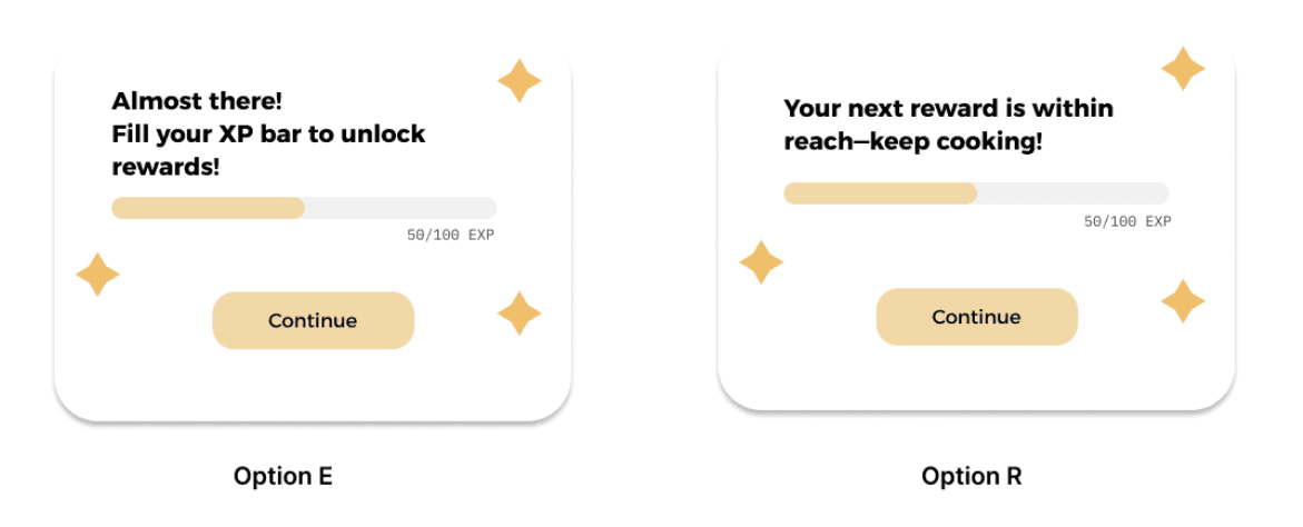
Most Engaging Message Tone: Users preferred friendly, motivational language. For example, “Your next reward is within reach—keep cooking!” scored highest in friendliness, motivation, and encouragement.
Challenge Messages:
Users favored messages that were motivating, rewarding, and clear.
Gamified rewards (e.g., XP, badges) drove user engagement, especially when paired with supportive messages.
Key Insight: Keep messaging upbeat, positive, and focused on progress.
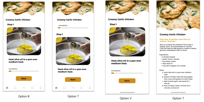
Color
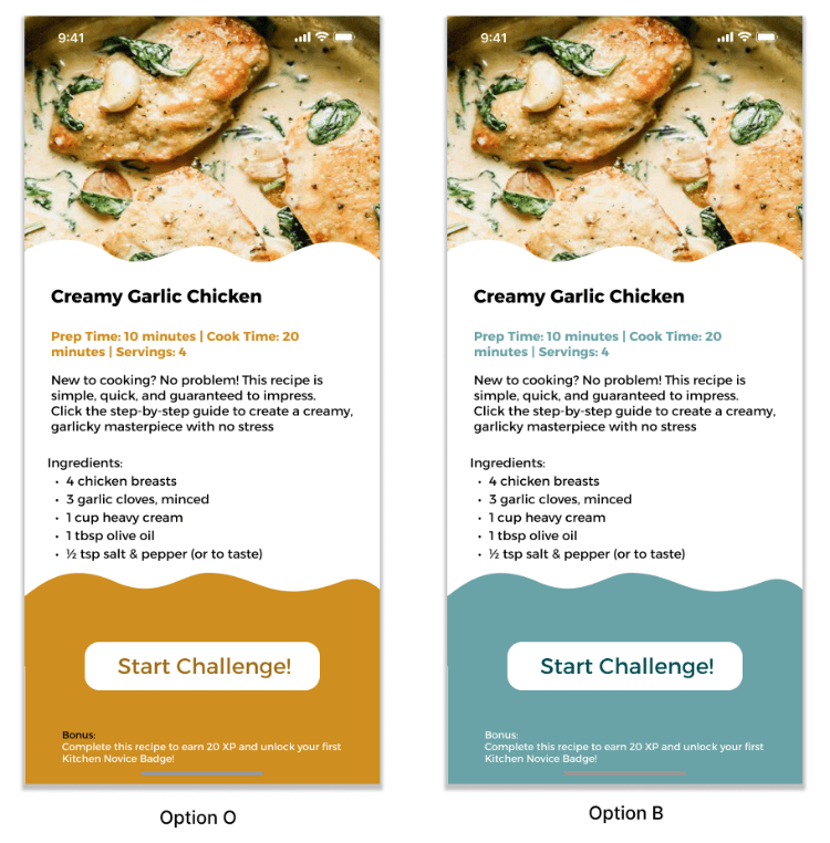
Preferred Scheme: Option B was seen as easier to use and more engaging, with 60% choosing it.
Key Insight: Users prefer simple, calming color schemes that don’t distract from the content but still create a welcoming vibe.
Key Insight: Use calming and clean colors for better usability
Layout
Preferred Recipe Format: 80% of users liked the option to toggle between visual (step-by-step) and traditional text formats.
Key Insight: Offering both visual and text-based formats caters to different learning styles and enhances usability.
Gamified Features
Gamified Features: Users responded well to missions, rewards, and progress tracking.
XP, badges, and streaks helped keep users motivated and engaged.
Progress Tracking: 40% found tracking their progress very important, emphasizing the value of completion bars or streaks.
Key Insight: Incorporate rewards and clear progress indicators to keep users motivated.
Conclusion
Final Thoughts
The user testing and design feature feedback have provided valuable insights that will help shape Whiskley into a more engaging, user-friendly, and motivating app for both beginner and experienced cooks. By focusing on simplicity, personalization, and gamified elements, we can create an experience that encourages users to build lasting, healthy habits in the kitchen.
Future Research
As we continue to enhance Whiskley’s user experience, several areas of research and development will help further optimize the app:
Gamification Impact: Explore how different types of rewards (badges, points, streaks) and challenges affect long-term engagement and cooking frequency.
Color Scheme Preferences: Investigate the impact of various color schemes on user mood and app usage duration, especially across different age groups or cultural backgrounds.
Personalized Recipe Recommendations: Test the effectiveness of personalized recipe suggestions based on previous cooking activity and preferences to increase user satisfaction.
Progress Tracking Features: Analyze how different progress tracking methods (e.g., achievements vs. completion bars) influence motivation and user retention.
Mascot Development & Interaction: Continue refining the mascot’s design and interactive features to enhance engagement. Future research will explore how the mascot’s tone, personality, and animations impact user motivation and overall experience.
Design A/B Testing: Conduct tests on different design elements (e.g., navigation, typography, color schemes) to understand their effect on usability, user satisfaction, and retention.
The end… or just the beginning?
You made it this far — might as well say hi!