Bridging Past and Future in
the Vatican Museum's Website
The old Vatican Museum website didn’t match the beauty or cultural depth of the museum itself. It was hard to navigate, not very accessible, and booking tickets was confusing. I redesigned it with a fresh, modern look—making it easier for people to explore, find what they need, and enjoy the experience. I handled everything from research to testing to make sure the new design felt clear, inviting, and true to the museum’s history.
The Problem
The Vatican Museum website didn’t live up to the experience of visiting the museum itself. Key information—like how to buy tickets—was buried and hard to find, making it frustrating for users to plan their visit. On mobile devices, the site felt clunky, with oversized buttons and a layout that didn’t adapt well to smaller screens. The design was outdated and lacked any sense of interactivity or visual excitement. And because the museum attracts visitors from all over the world, the limited language support created confusion for many users trying to navigate the site in their native language.
Our goal was to make the site easier to use, especially for finding ticket information, which had previously been buried. We improved the mobile experience for smoother navigation across all screen sizes. The entire site was given a fresh, modern look that feels more inviting and aligns better with the museum's rich history.
Data
Research
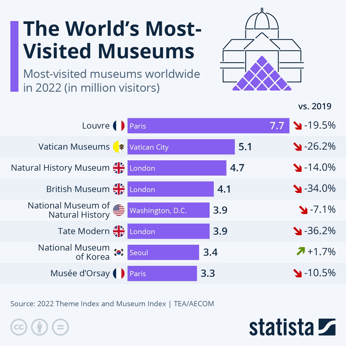
To start off the redesign, I started by gathering inspiration and doing a competitive analysis. I looked at top museum websites like The Met, The British Museum, and The Louvre to see how they structure their pages, present content, and guide users through ticket booking and exploring exhibits.
At the time, the Vatican Museums website wasn’t keeping up with top museum sites like The Louvre, The Met, or The British Museum. The content was amazing, but the experience wasn’t. Their online presence did not have the same reach compared to other museums. The goal was to modernize the site and make it
just as engaging and easy to use as these other world-famous museums.
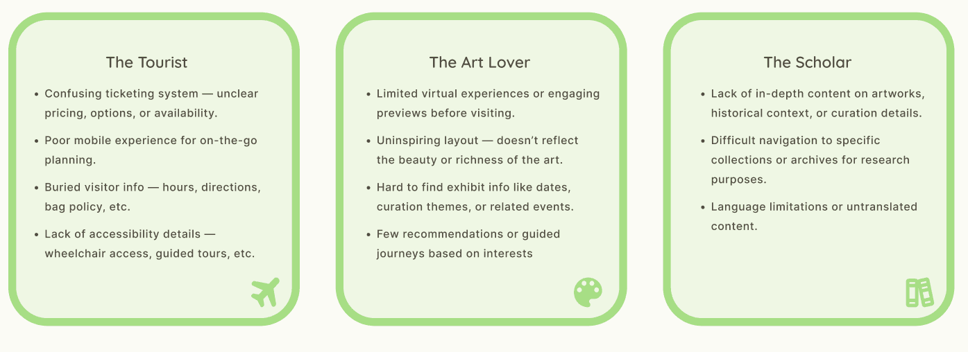
Understanding Users Pain Points
The Vatican Museums attract all kinds of visitors, each with different needs. No matter their background, everyone wanted a smooth, informative, and
enjoyable experience.
Design
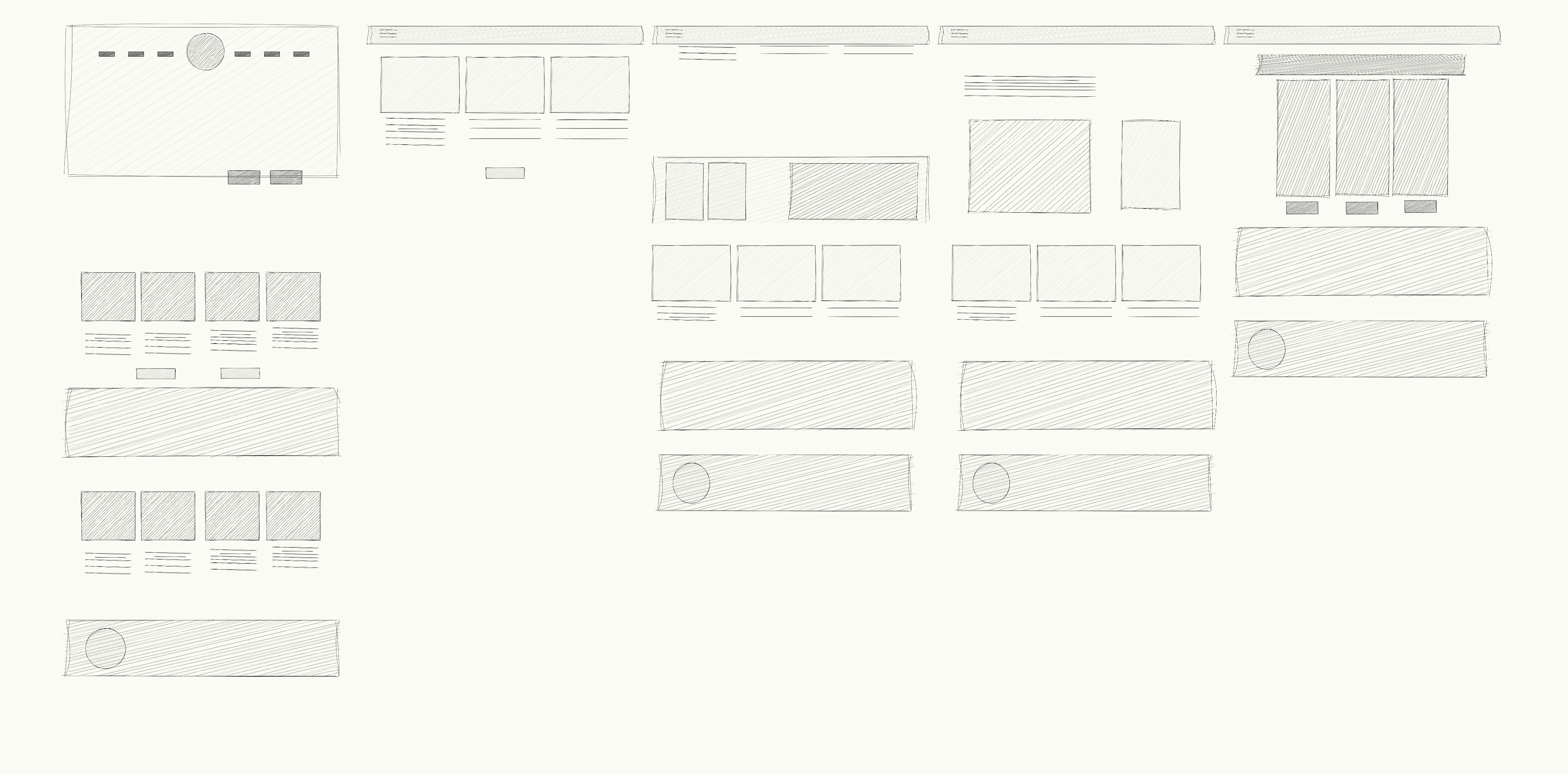
Wireframing
I took another look at how signature museum websites were laid out.
I paid attention to how they structure their pages and guide visitors, and I tried to mirror that same flow in my own wireframes. My goal was to create something that felt familiar but tailored to the Vatican’s unique content.
I created low-fidelity wireframes that focused on a clean layout, clear navigation, and easy access to things like ticketing, exhibit previews, and planning tools.
I built out desktop and mobile versions side by side to make sure everything would be responsive. Since a lot of people browse on their phones while traveling, I wanted to make sure the mobile experience was just as smooth as desktop. These wireframes acted as the backbone for the rest of the design.
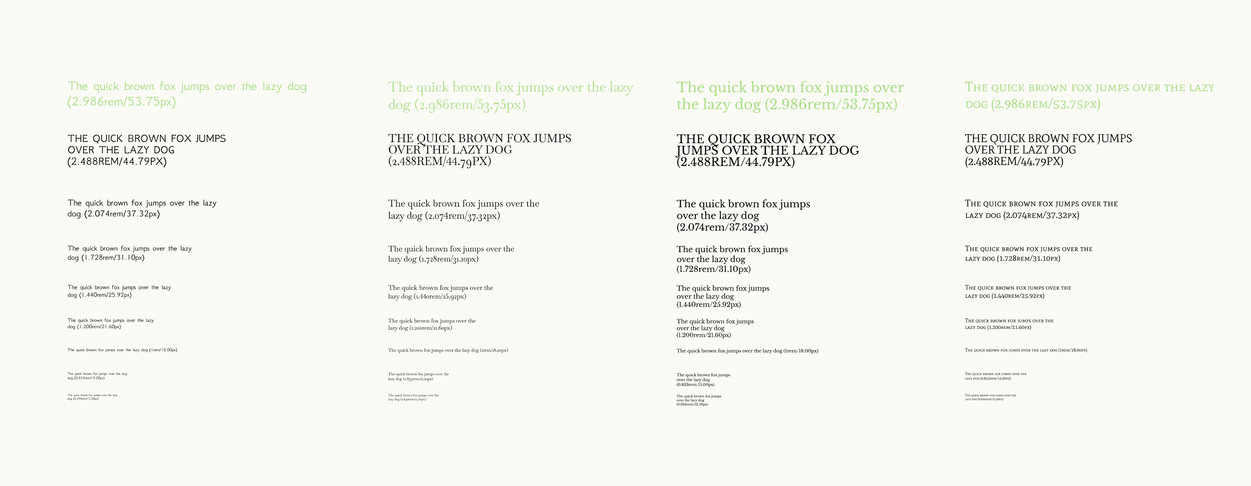
Typography Exploration
To reflect the Vatican Museums’ classical and sacred identity, I explored typefaces that balanced historical elegance with modern readability. I tested both serif and sans-serif options, considering legibility across devices and visual harmony with the artworks.
After comparing several typefaces, I selected Baskerville for headings due to its refined, timeless character, and Neohellenic for body text to ensure clarity and accessibility. This pairing reinforces the museum's heritage while supporting a clean, user-friendly digital experience.
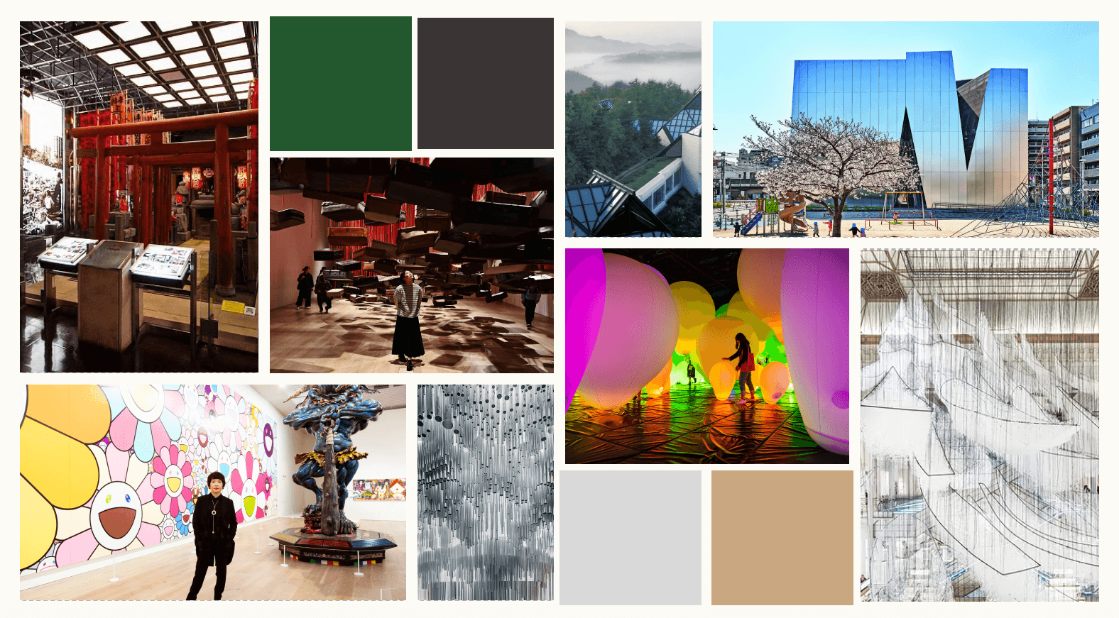
Mood board
With the wireframes ready, I moved on to bringing the design to life. I chose a color palette inspired by Modern and Classic art including blacks, browns, deep emeralds.
Final Design
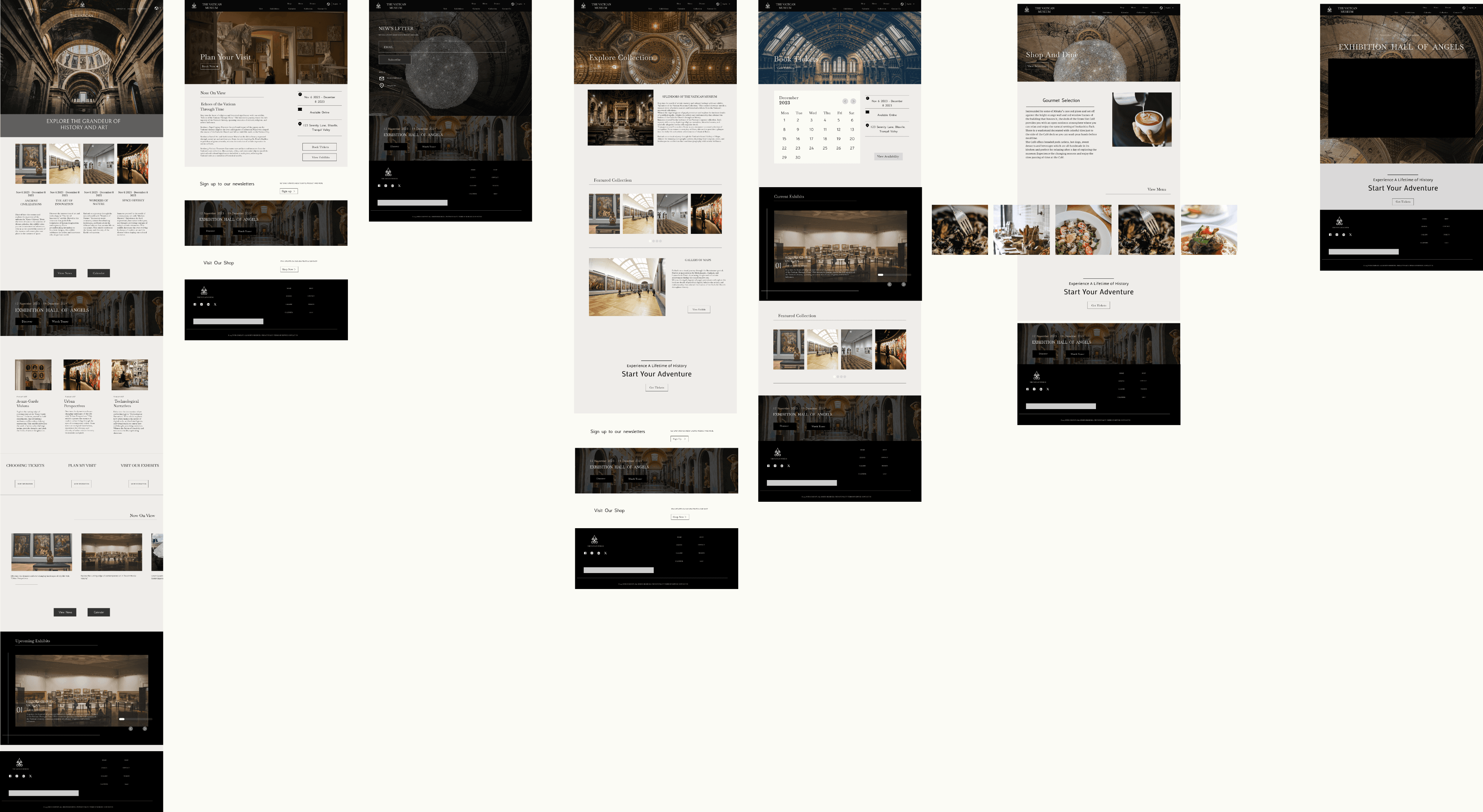
The homepage features a section with clear buttons to “Plan Your Visit” or “Buy Ticket” added simple hover effects to help users feel where they are on the site. Everything was designed with mobile in mind, so the layout adjusts naturally to different screen sizes plus modular content blocks to guide users to exhibits, virtual tours, and more.
I built the designs in Figma and received feedback from peers, which helped me refine the visual hierarchy and flow. Overall, the look balances a modern feel with the history and prestige of the Vatican Museums. Quiet and Historical
Conclusion
Final Thoughts
Redesigning the Vatican Museums website has been a super fun project. I started by digging into research—looking at competitor sites, building a moodboard, creating personas, and mapping out the user journey. My main goal was to make the site easier to navigate while keeping the feeling of wonder and history that the Vatican is all about.
I’ve already created the wireframes and final designs, but there’s still some fine-tuning I want to do. Next, I’ll be polishing the details, making small usability improvements, and preparing for user testing to catch anything I might have missed. I'm excited to keep pushing the design even further and make sure it’s as strong (and easy to use) as it can be!
The end… or just the beginning?
You made it this far — might as well say hi!